How SKUVE works
A store that builds itself around what the shopper needs.
An AI shopping assistant that answers like a consultant, asks the right questions, and builds the screen around the shopper's decision.
Your storefront already serves one kind of shopper well: the one who knows the product name, types it into search and buys. The other kind is the one you lose. They know the occasion, the problem or the person they are buying for, and nothing else. Filters do not help them, because a filter assumes you already understand the category. A long product grid does not help them either, because the work of comparing is still theirs.
SKUVE takes that shopper. They describe the situation in their own words, and the assistant reads the intent and assembles a screen around it: which blocks appear, in what order, how much detail each one carries, what the screen looks like. It answers, the way a good consultant would. But it does not stop at a reply. The AI builds the interface.
One dynamic screen. Every need.
SKUVE opens full screen over your store, not as a widget in the corner. No sidebar, no product grid still visible behind it, nothing else asking for a click. On mobile it takes the whole screen, which is where this kind of shopper struggles most.
There is nothing to learn. No menu, no navigation, no interface to get used to. One screen, and it adapts to the shopper instead of the other way round. For someone facing a catalog of two thousand products, that is the difference between a chore and something closer to play.
Your storefront keeps working exactly as it does now. SKUVE is an entry point for people who came to look, not a replacement for the path of people who came to buy.




The need matters more than the product name.
Most shoppers do not know the name of the thing they need. They know the context around it.
A gift for a father who fishes and already owns everything obvious. A replacement for a blender that worked fine but was too loud. Something that goes with a jacket, which they can upload a photo of so the system sees it. A first purchase in a category they have never bought in and do not want to become an expert in.
SKUVE starts from that sentence and asks its own follow-up questions when it needs more: never a fixed questionnaire, only what the case actually requires. Shoppers who would rather not type at all can answer dynamic prompts instead.
SKUVE is at its best exactly where a store is at its worst: the shopper has a need, no expertise, and no wish to acquire any. Not everyone wants five hours of research to buy the right coffee grinder. Most people want the right one, chosen for them, with the reason why.

Different intent. One dynamic screen.
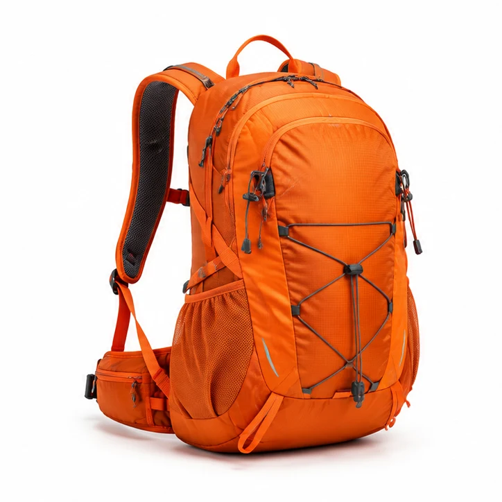
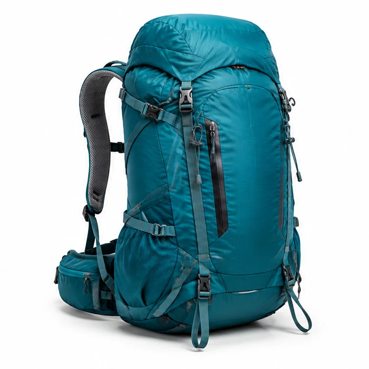
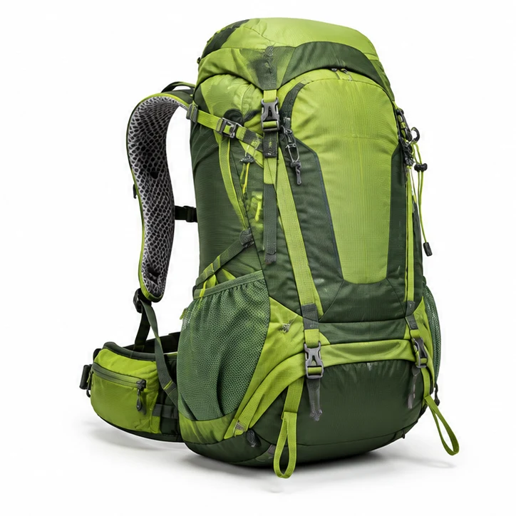
Gift. Step 2 of 7. Adding the details. The bright day-trail pack. 3 matching products.
This is what an AI shopping assistant can do that a chat window cannot.
A chat window has one output: text, and then a list. Every scenario looks the same in it. A gift, an upgrade and a fast repeat purchase are completely different decisions, and a chat window gives all three the same list in the same layout.
SKUVE has more than ten modes, and the screen changes with the mode. Six of the most common:
Gift. The system works out the taste and context of the person receiving it before it shows anything.
Replacement. It asks what the shopper had before and what annoyed them about it, then rules out the same mistake.
Upgrade. It shows what actually changes versus what they own now, instead of the full spec sheet.
Match what you have. A photo is enough for the system to understand what it is matching to.
Comparison. Two or three real candidates, compared on the attributes that matter for this case, not on every field in the catalog.
Fast purchase. One confident pick and the reason for it, for shoppers who want the decision made.
The frame stays constant and the shopper never leaves the page: the screen rebuilds in place, block by block, with every answer. Nobody has to learn a new interface, and it never reads as a form to fill in. Colors shift with the product in focus. That is our bet on what makes the screen feel built for this choice rather than like ecommerce personalization bolted onto a template.
Inside SKUVE: no filters, no banners, no popups.
No wall of filters. No category trees. No banners, no countdown discounts, no popups fighting for the corner of the screen. That is the layer that wore shoppers out, and SKUVE keeps it out of its own screen. What is left is one simple screen and the decision.
Two hundred cards isn't a choice. It's homework.
The comparing has already been done for the shopper. Fewer options, better reasoned, in the order that matters for their case, with the amount of information a non-expert can actually hold in their head.
There is a second effect that merchants underrate. When a shopper picks alone out of two hundred cards, every doubt is theirs to carry, and doubt is what closes tabs. When the system leads, the weight of the choice moves off the shopper. That is a large part of why a guided decision holds up better after the purchase, and why fewer of those orders come back.
From there the shopper continues in your store the way they always have. SKUVE does not take payments and does not replace your checkout.

A consultant who asks the right questions.
Product finder quizzes were the first honest attempt at this, and the reason so many Shopify stores install one is that the need is real. But a product quiz is a fixed tree: somebody wrote the questions in advance, wrote the answers in advance, and mapped them to a fixed set of results.
SKUVE asks the way a good salesperson asks: only what this case needs, decided while the conversation is happening. It rebuilds the screen after every answer. Nothing is authored in advance except the components it is allowed to use.

Your store stays your store.
SKUVE sits on top of your store, not instead of it. Everything a shopper can do today they can still do tomorrow: browse collections, use search, land on a product page from Google or an ad and buy right there. That path is untouched.
What changes is small and visible. The chat icon in the bottom right corner becomes the SKUVE entry point. And you get a few optional blocks for your theme — an announcement block, a section, a button on collection pages — that invite the shopper to try the new experience. Where they go is your call, in your theme customizer.
Nothing in your structure moves. Pages, URLs, navigation, product data and checkout stay exactly as they are. SKUVE runs on your own domain as a Shopify Theme App Extension, opens only when a shopper clicks, and loads after the page is already interactive. Your SEO, your analytics and your page speed are not touched.
What the model is allowed to do. It picks from interface components we designed and cannot invent a screen we have not built. It never generates code. It takes no commercial actions: no prices, no payments, no orders. Your catalog, your data and your availability are the only source of truth.

No rebuild. No developer. No new checkout.
Installation. SKUVE installs as a Shopify Theme App Extension, the native Shopify integration path. No theme rebuild, no developer sprint, no changes to your product pages or your checkout.
Access. We agree on the Shopify access we need and on how the entry point looks in your theme customizer. That is the whole setup conversation.
Onboarding. We onboard your store by hand and tune the modes to your catalog, then keep tuning them while you use it. This is early access and we say so plainly.
Don't hand your customer to somebody else's assistant.
Shoppers are starting to ask ChatGPT what to buy. ChatGPT does not own your catalog, your inventory, your merchandising rules, your checkout or your relationship with the customer. You do. It can talk about products. It cannot decide how yours are presented, which of them you want moved this month, or what happens after the sale.
Agentic commerce integrations like ChatGPT Instant Checkout do not change that, they sharpen it. As the large platforms plug into stores directly, your products become one feed on somebody else's surface, ordered by their ranking and monetized by their advertising. Traffic from there will get more expensive, and at that scale the large marketplaces win on integration by default. Your own AI experience, on your own domain, is the one place where the rules, the data and the customer stay yours.
Free while we're early. You keep the early price forever.
The current version of the AI shopping assistant is free. We are in early access, the number of stores we take is limited, and setup and the trial period are on us. Stores that come in now keep a permanent early access price when pricing arrives.
FAQ
What is an AI shopping assistant, and what makes SKUVE one?
An AI shopping assistant helps a shopper work out what they need and then narrows the catalog down to it, instead of waiting for a search query and returning matches. SKUVE is a Shopify AI shopping assistant that does this through a generative interface: it reads the intent behind a sentence like "a gift for my father who fishes" and assembles the screen for that case, choosing the blocks, the depth of information and the visual treatment. The assistant selects from components we designed. It does not write the page.
How is this different from the chatbot we already have?
A chatbot is a layer on top of the old interface. The shopper still has to phrase the request correctly, and then still has to work through whatever list comes back, which in most cases is the same list your catalog would have shown. It replies.
SKUVE changes the interface itself. Each scenario gets its own screen, with the blocks that scenario needs and the amount of information it needs, and the screen is rebuilt as the conversation moves. It leads. That is also why we do not put it in a corner of the page: a decision this loaded needs the whole screen, not a 380 pixel window.
Is this agentic commerce?
No, and the difference is the point. Agentic commerce, in the sense of ChatGPT Instant Checkout or Stripe's Agentic Commerce Protocol, means an AI agent completes the purchase for the shopper, usually away from your store. SKUVE is built for the opposite outcome. It uses the same kind of intent understanding, but to help the shopper decide inside your storefront, on your own domain, and then hands them to your own checkout. It takes no commercial actions: no prices, no payments, no orders. The shopper stays on your site, and the sale stays yours.
Will this hurt the conversion rate of my store?
No, and the reason is structural. Your store stays as it is: a shopper who lands on a product page from search or an ad buys there without ever seeing SKUVE. The assistant works for the visitors who arrive to look around, get lost in the catalog and leave with nothing, which is often the larger group. The question is not which interface the purchase happened in, because you sell products, not interfaces. What matters is the store's overall conversion rate.
Does it adapt to our brand?
The entry point and the way SKUVE is invoked are styled to your brand. Inside the interface the color scheme shifts dynamically with the product in focus. That is part of the mechanism we are betting on: it holds attention on the item being considered and makes the choice easier to make.
What does it cost?
Right now, nothing. This version is free: we install it, onboard your catalog by hand and run the trial period at our cost, because we are still shaping the product on real stores. Pricing later will be per search iteration rather than a monthly subscription or a percentage of your sales, and the order of magnitude is cents. We are not quoting a final number while model costs on the market are moving this fast, and stores that come in now keep a permanent early access price.
Why can't we just build this ourselves?
You can build a version of it. The expensive part is not the first build, it is that a system like this is never finished: modes, prompts, the component registry and catalog tuning all have to be maintained and extended as models change, and models change monthly. In house that becomes a standing team, not a project. Buying it costs less than staffing it, and you inherit the tuning from every store that came before yours.
Why not buy something similar from another vendor?
Two honest answers. On the search and product discovery side there are established platforms, and they are priced for enterprise budgets and sold on annual contracts. On the side we are actually on, an adaptive interface rather than a chat interface, we do not know of a comparable product. Most people who book a call with us do it because they saw the interface and could not find anything like it. The useful questions to ask any vendor here are the same three: will they let you test it for free, what does it cost, and how much of it have they built already.
How stable is it, and will it work on our catalog?
We are in early access and we do not pretend otherwise. The application has been tested, and language model quality keeps improving month over month. But the part that always has to be proven is catalog specific. So we prove it on your store, by hand, with you: we tune the modes to your categories and keep improving them while you use it.
What happens when it cannot find a good match?
It narrows instead of pretending. When the catalog has no strong candidate for the case, SKUVE shows the nearest options it can justify and tells the shopper where the fit is loose, so they decide with that in mind rather than with a confident pick that turns into a return. Where that line sits is different in every catalog, so it is one of the things we tune with you during onboarding.
Our niche already has chatbots. Are we too late?
With a chatbot you would be catching up to the stores that installed one earlier and have been collecting data since. With SKUVE you skip that race: they have a dialog window, you have a different interface for buying. If you are a newer store, this is the cheapest way to look ahead of established competitors instead of behind them.
Does it work on mobile?
Yes, and mobile is where it matters most. SKUVE takes the full screen on both desktop and mobile, and the layout is built for each. It opens only when the shopper taps the entry point, never on its own. A shopper comparing options on a phone has the least room to work with and the most reason to give up, which is exactly the case a guided interface fixes.